Carbo Farm Calculator
Solo designer for a farm-level sustainability platform. From design system to final screens in 4 months, now covering 60% of Finland's dairy milk supply.
Valio needed a tool that could take a serious carbon-accounting model and put it in the hands of dairy farmers who have never used anything like it. I was the only designer on the project, and we had about four months to go from nothing to launch.
The calculator now covers 1,900+ farms and 60% of Finland's milk production. It's Carbon Trust certified. I designed everything from the system tokens to the final screens, trying to make something scientifically rigorous feel simple enough that a farmer would actually use it.
The Problem
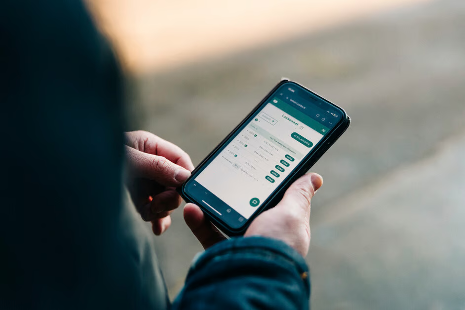
Carbon accounting for a farm is structurally messy. Emissions come from feed, herd composition, manure, energy, soil, transport, and machinery, each with different rules and dependencies. The underlying model was scientifically rigorous; the user needed a path through it that did not feel like accounting software.
There was no established category pattern to borrow from. This was a 0→1 product problem: build trust in the methodology while keeping the interaction model understandable for people whose job is running farms, not decoding climate frameworks.
My Role
Solo Lead Designer · ~4 months
I owned the end-to-end product surface: input architecture, screen design, the supporting design system, results views, and reporting outputs. I worked directly with Valio's sustainability specialists to understand the IPCC-based model well enough to decide where the complexity should stay visible and where the interface should absorb it.
That distinction mattered. The point was not to simplify the science. The point was to make a rigorous method legible, navigable, and useful in day-to-day decision-making.
Interaction Model
The first design task was structural: map every required input, understand the dependencies, then decide how much of that complexity the product should handle for the user. That produced a grouped input architecture organized around how farmers think about their operations rather than around the raw logic of the emissions model.
The product then used progressive disclosure to keep detailed sub-categories available without making the whole workflow feel like a wall of forms. The result layer translated the calculation outputs into a clearer picture of current footprint, reduction opportunity, and what to work on next.
What the Product Had to Do
Translate Science into Usable Inputs
Turn an IPCC-based calculation framework into grouped, comprehensible data-entry flows that farmers could complete without needing specialist literacy in carbon accounting.
Control Complexity with Structure
Use progressive disclosure and clear information architecture so the system could stay rigorous without presenting every dependency at once.
Make the Output Actionable
Present results in a way that connected emissions data to practical reduction targets rather than leaving users with raw CO₂e numbers and no sense of next action.
Why It Landed
The credibility of the product came from two places working together: the methodological rigor behind the calculation and the interface clarity that let users engage with it confidently. That is the core design achievement here. Farmers did not need a simplified story. They needed a dependable one they could actually use.
The product's reach later made that clear. This was not a speculative prototype. It became part of a real national sustainability program operating across a large share of Finland's dairy supply chain.
Adoption Signal & Program Context
1,900+ farms
Adoption signal
~60% of Finland's milk
Supply-chain reach
30% CO₂e reduction
Operational target
130,000 ha farmland
Program context
Launched February 2020
Program milestone
Carbon Trust certified method
Validation signal
The hardest part wasn't the interface. It was earning the trust of people who know carbon science far better than I do, and making something they'd actually endorse putting in front of farmers.