CommonUX Design System
Led design system work for ABB CommonUX, serving 120 designers across 20+ business units at a $32B global industrial company.
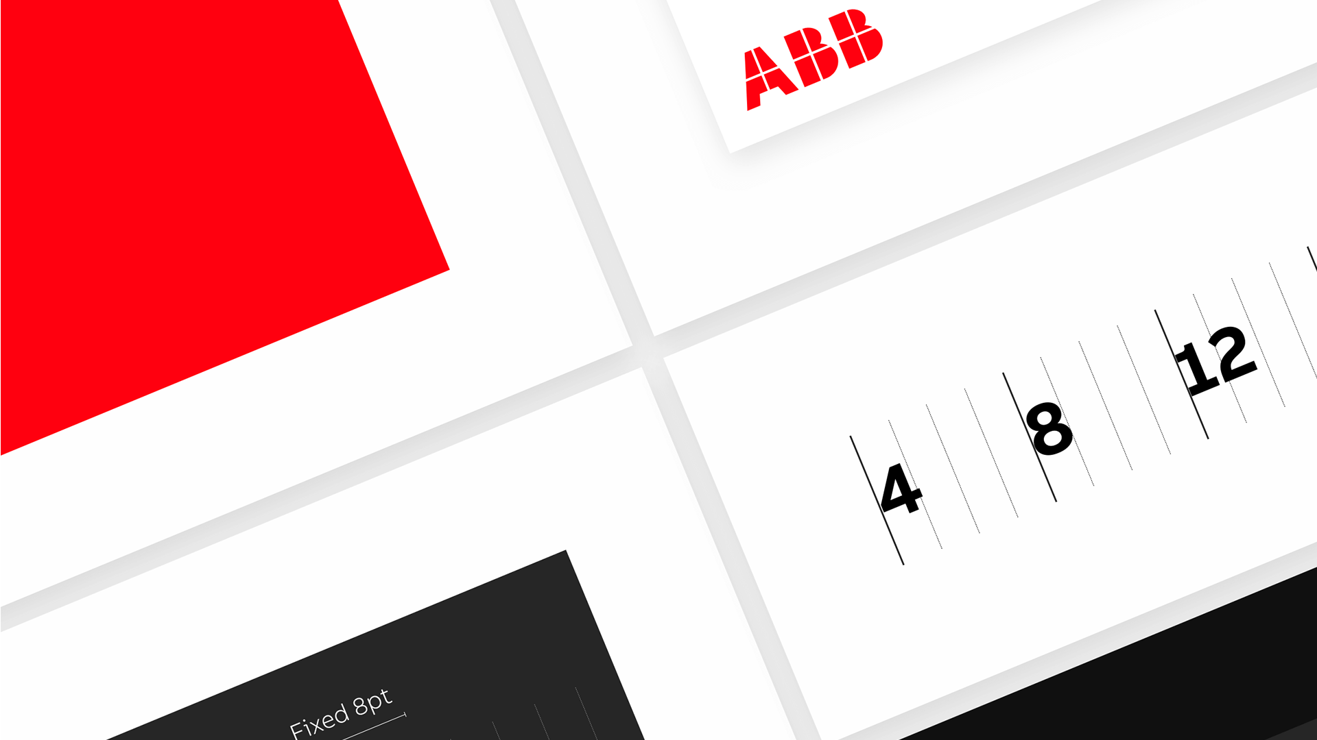
ABB has 120 designers spread across 20+ business units and a $32B product portfolio. When I joined the CommonUX core team, it was two of us. The design system needed to go from a component library to something that could carry a full corporate rebrand across automation, electrification, EV charging, and process control.
I did three things: redesigned the system to ABB's new visual identity, built the variable architecture it was missing, and created a data visualisation colour system that engineering teams could actually apply consistently.
The Problem
CommonUX 2.0 existed, but the system was still carrying decisions in styles rather than in a scalable variable structure. That meant theming was fragile, component behavior drifted between teams, and ABB's product surface could not adapt cleanly to brand updates or product-specific contexts.
The gap was even more obvious in data-heavy interfaces. There was no shared colour logic for charts, dashboards, or process monitoring views, so teams were making local decisions in one of the most trust-sensitive parts of the UI.
Variable Architecture
The core contribution was not a new visual layer. It was the token logic underneath the system. I helped migrate CommonUX from static styles into a usable variable architecture so color, spacing, typography, and theming decisions could be expressed once and reused coherently across the product surface.
That changed the system from something teams referenced into something they could actually build from. Brand updates, theming, and cross-product consistency stopped depending on manual judgement in every file.
Design Contribution
My contribution sat in three linked layers. First: rebrand the system so its visual language matched ABB's current identity. Second: build the variable architecture required to make those decisions portable. Third: define the missing data visualisation colour logic so dashboards, gauges, and industrial charts could stop behaving like one-off local inventions.
Taken together, those changes made the system more governable. Designers had clearer rules. Engineers had more stable implementation targets. Product teams had less room to diverge accidentally.
What Changed in Practice
Rebrand at the System Layer
Updated the design-system foundations so ABB's brand was expressed through tokens, components, and reusable patterns rather than manual screen-by-screen styling.
Variables Instead of Fragile Styles
Moved the system toward a variable-driven structure that could support theming, product variation, and future maintenance without rebuilding component logic.
Shared Data-Viz Rules
Created colour guidance for charts and monitoring interfaces so data-heavy views could read consistently across teams, products, and operating contexts.
Governance at Scale
This was a 2-person core design effort supporting a large distributed design organization. The important constraint was not only technical scale, but social scale: every system decision had to survive handoff across business units with different habits, priorities, and product histories.
The work mattered because it reduced ambiguity in the places where design systems usually fail: theming, shared component logic, and chart-heavy product surfaces that teams otherwise customize into fragmentation.
Design Contribution & Program Context
Rebrand + variable architecture
Design contribution
Shared data-viz colour system
Design contribution
120 designers served
Program context
20+ business units
Program context
2-person core team
Team structure
$32B ABB context
Platform scale
The most convincing design-system work is usually the least theatrical. It is the variable, the token, and the shared chart rule that lets separate teams make compatible decisions without negotiating every screen from scratch.